Frasers Fit Branding & Communications
Everlast/Frasers Group
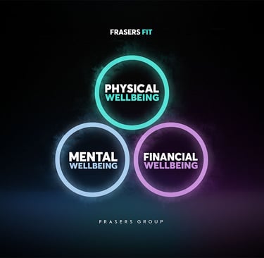
Frasers Group in conjunction with Everlast Gyms wished to promote an initiative over employees well-being across both companies. This would be a full branding to help identify the incentive over other company communications and entice employees to explore three options in line with their help; financial, mental and physical well being.
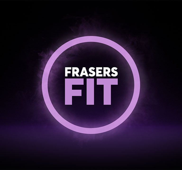
I differentiated the three types of wellbeing in to three coloured rings, each aligned with previous company communications that had come before, but had never been solidified in to a collected identifiable brand. To align with Everlasts recent re brand and gym inteior styling I opted for a dark theme leaning on a neon light effect, reminiscent of the lights they decorated their gyms with. The inital logo design was mocked up and developed in photoshop, with all assets to be later collated in Illustrator/InDesign.


Logo Design


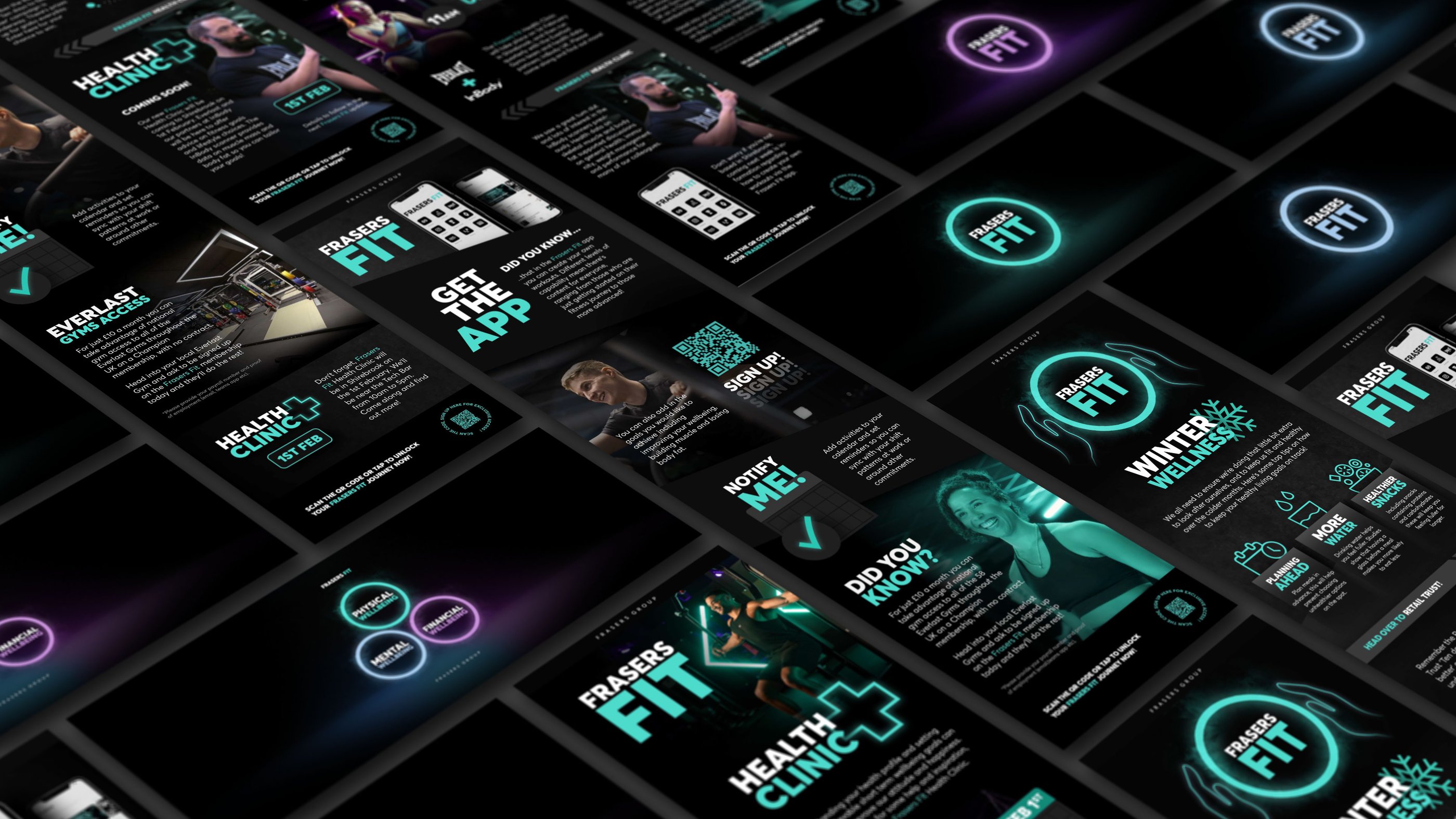
Mobile Newsletter Communications
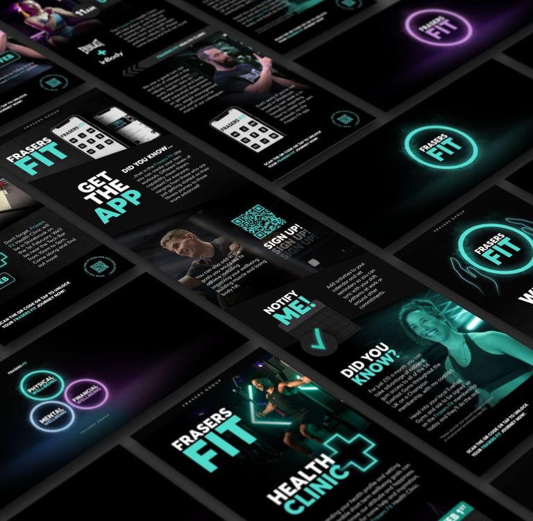
I was tasked with delivering the first few communications, which would act as basis for other in house graphics designers to follow. The designs were optimised in long format for mobile readability as most of the employees received these communications via mobile. The format to follow was an eye catching header to lead the eye in, followed by broken up sections using a mixture of photos and iconography to describe the text. I avoided breaking up the designs with over stated lines to encourage the audience to read through to the end of the communication. The call to action was a link/QR code sign posting employees to download the Frasers Fit app for use in Everlast gyms.
